Top Tips for Choosing Colors for Silk Flower Sets

Time:2026-11-19 Author:Isabella
0%

Choosing colors for silk flower sets can feel simple until you place the blooms beside a wall, tablecloth, or favorite vase. A soft ivory rose may look warm in daylight but appear almost gray under cool bulbs. Small details matter. Petal color, leaf tone, and even the sheen of the fabric can change how an arrangement feels.

This guide explores How to choose the right color palette for silk flower sets, with practical tips for matching flowers to rooms, occasions, and personal taste. Start with the setting: note the dominant colors, the amount of natural light, and nearby textures such as linen, wood, or glass. Then decide whether you want harmony or contrast. Cream and sage can create a calm look, while coral against deep green feels livelier. Neither choice is automatically better.

When comparing options, view samples together in the space where they will be displayed. Photos can hide undertones, and silk finishes sometimes reflect light differently than expected. I have found that one unexpected accent can make a set feel more personal, though it can also become distracting. That is worth checking before you commit. Consider the season and the mood, but do not treat color rules as fixed. A palette that looks beautiful on a screen may need a small adjustment in real life. The goal is not perfection; it is a balanced arrangement that feels right in its surroundings.
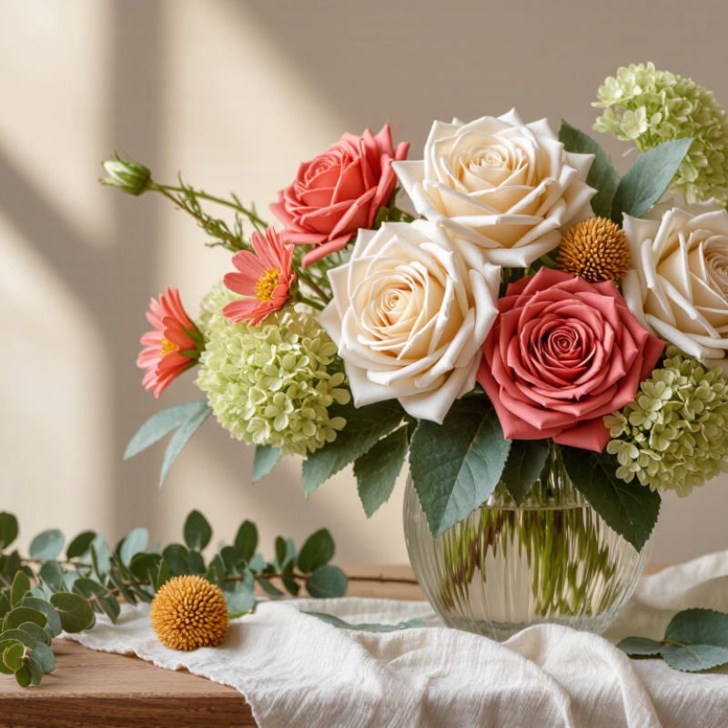
Top Tips for Choosing Colors for Silk Flower Sets

Define the Purpose and Setting of the Silk Flower Arrangement

Before choosing colors, decide what the silk flower arrangement needs to do. A dining-table centerpiece should invite conversation, not block anyone’s view. Measure the table and keep the tallest stems below eye level when guests are seated. For a hallway console, a taller, fuller design can create a clear focal point. Check the light, too. A cool white room can make pale petals look icy, while warm bulbs may deepen cream and peach tones.

The setting also guides how much contrast to use. In a calm bedroom, soft blush, sage, and ivory can sit quietly against neutral bedding. A busy entryway may need stronger color, such as deep blue beside warm orange, so the flowers remain visible among coats and bags. Match one shade from nearby fabric or artwork, then add a smaller accent rather than copying every color. Test swatches in the room at different times of day; silk reflects light differently from fresh petals. I still sometimes choose a shade that looks perfect in the shop and too bright at home. It happens. Take a quick phone photo before settling on the palette, and check whether the arrangement feels balanced from the doorway as well as up close.

Top Tips for Choosing Colors for Silk Flower Sets

Define the arrangement’s purpose and setting before choosing a palette.

Illustrative planning ratings from 1 (less suitable) to 5 (more suitable), not survey results. Consider the mood, surrounding décor, and lighting when selecting silk flower colors.

Choose a Color Palette That Matches the Space

Begin with the colors already present in the room, rather than choosing silk flowers in isolation. Note the wall tone, flooring, upholstery, and any artwork nearby. A warm beige room may suit ivory, dusty peach, and muted green. Cool gray walls can make soft blue, plum, or crisp white feel more at home. Small shifts matter.

Check the space in its usual light. Daylight can reveal undertones that warm evening bulbs soften, so compare flower samples near the intended display spot. A phone photo may help, but screens can distort color. Trust your eyes in the room. I have found that a shade that looks gentle on a table can seem surprisingly bright against a pale wall.

Repeat one or two existing colors to make the arrangement feel connected, then add a contrasting accent for definition. For example, a cream sofa and tan rug could pair well with ivory blooms, leafy greens, and a few rust-colored stems. In a compact room, a tightly mixed palette often feels calmer than many competing shades. Still, rules are imperfect: a bold arrangement can work if the rest of the space stays quiet. Lay out the flowers beside nearby fabrics before arranging them, and adjust the mix if one color pulls too much attention.

Balance Flower Hues, Foliage, and Accent Colors

Silk flower sets look most convincing when flower colors, foliage, and accents share a clear relationship. Choose one dominant hue, such as soft coral, then support it with quieter shades like cream and dusty rose. Keep foliage in view, too. Deep green leaves can make pale petals feel brighter, while silvery leaves soften strong colors. A quick test helps: place the stems together in daylight and step back several feet. If one flower grabs all the attention, adjust its neighbors rather than adding more colors.

Tips: Use a simple ratio: about half the blooms in your main color, a third in a supporting shade, and the rest as accents. Repeat accent colors only once or twice. For example, pair white blossoms with muted green foliage and a few burgundy buds. Check the set beside its intended vase or room; colors can shift under warm indoor lighting.

Texture matters alongside hue. Glossy silk petals may look brighter than matte leaves, so balance them with natural-looking greenery or smaller, less saturated blooms. I sometimes find a carefully matched palette looks a little too tidy; one unexpected shade can make it feel more natural. Still, keep that accent small. Try a single amber flower among cream and olive tones, then remove it if it competes with the focal bloom.

Consider Lighting, Season, and Surrounding Decor

Test silk flower sets under the room’s actual bulbs, not just showroom lighting. Warm lamps can turn ivory petals creamy and mute cool lilac; north-facing daylight may make the same stems look bluer. Check it twice. The CIE report Method of Measuring and Specifying Colour Rendering Properties rates general colour rendering, Ra, on a 0–100 scale. For a truer preview, compare flowers under high-colour-rendering lighting and beside the fabrics or paint they will sit near. A phone photo can help, but its screen may distort the shade.

Let the season guide the palette without making it a rule.
Soft greens, pale apricot, and blush can feel light in spring; rust, plum, and deep foliage bring autumn warmth. Then check the surrounding decor: repeat one small colour from a cushion, curtain, or framed print, and let other stems provide contrast. Against a busy patterned sofa, fewer flower colours usually read more clearly; against a plain wall, varied petal tones add depth. I’d still leave a little room for imperfect matching. Silk petals catch light differently from fabric, and a carefully chosen shade can look unexpectedly flat after sunset.

Test Color Combinations Before Selecting a Set

Top Tips for Choosing Colors for Silk Flower Sets

Test Color Combinations Before Selecting a Set

Before choosing a silk flower set, test the colors together in the room where they will sit. A warm ivory rose may look soft beside sage leaves, yet turn yellow under a nearby lamp. Place sample stems against the wall, furniture, and fabric. Check them in daylight and again after dark. Light changes everything. You may need to adjust the mix.

Color preference data can offer a starting point, not a formula. YouGov’s 2015 international survey across 10 countries found blue was the most popular color in every country surveyed, with results ranging from 23% to 33%. The survey measured general color preferences, not floral purchases. So a popular shade may still feel wrong in your home. Test a small group of blooms before selecting a full set.

Tips: Arrange three or four stems in a clear vase, then photograph them against the intended backdrop. Compare the image in different lighting; phone screens can shift color, so trust your eyes too. Try one dominant shade, one supporting color, and a small accent. Take a second look tomorrow. Your first combination may not be the best one.

FAQS

How tall should a dining-table arrangement be?

Keep the tallest stems below seated guests’ eye level. Measure the table before arranging.

Should a hallway arrangement be as low as a centerpiece?

Not necessarily. A taller, fuller design can create a focal point on a hallway console.

How can room lighting affect silk flower colors?

Cool white light can make pale petals look icy. Warm bulbs may deepen cream and peach tones. Light changes everything.

How can I choose colors that suit a room?

Match one shade from nearby fabric or artwork. Add a smaller accent, rather than copying every color.

What is a simple way to test a color combination?

Place three or four stems in a clear vase. Check them against the wall and furniture.

Should I check the flowers in different lighting?

Yes. Look at them in daylight and after dark. Silk can reflect light differently from fresh petals.

Can a popular color guide my choice?

It can offer a starting point, but personal preference matters more. A shade that looks popular may still feel wrong at home.

How can I tell if an arrangement feels balanced?

View it from the doorway and up close. Take a phone photo, then check the colors again tomorrow. Phone screens can shift shades, and I still get this wrong sometimes.

Conclusion

How to choose the right color palette for silk flower sets starts with understanding the arrangement’s purpose and where it will be displayed. A calm, coordinated palette may suit a bedroom or office, while brighter contrasts can bring energy to a gathering space. Consider the room’s existing colors and choose flower hues that complement its walls, furnishings, and overall mood rather than compete with them.

Create balance by pairing the main flower colors with natural-looking foliage and a small number of accent shades. Lighting can change how colors appear, so consider whether the arrangement will sit in warm indoor light, cool daylight, or a dim corner. The season and nearby décor can also guide your choices. Before selecting a complete set, place color samples together or compare them in the intended space to see how they work as a whole. This simple check can help create a silk flower arrangement that feels harmonious and well suited to its setting.

Isabella

Isabella

Isabella is a dedicated marketing professional with a sharp focus on driving brand growth and engagement through strategic content creation. With an extensive background in digital marketing, she combines her passion for storytelling with her keen understanding of industry trends to deliver......